Intro:
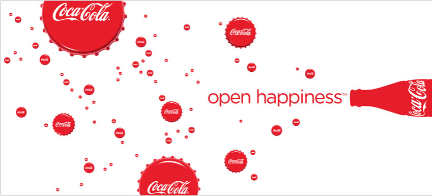
Patty Orlando a Creative/Art Director at Wieden+Kennedy created this Coca-Cola ad to advertise this product on billboards and newspapers in 2009. Coca-Cola has made a big name for itself being one of the most well known beverages in the world since its start in 1886. Coca-Cola is only continuing to grow as the years go on being a global company.
Contrast:
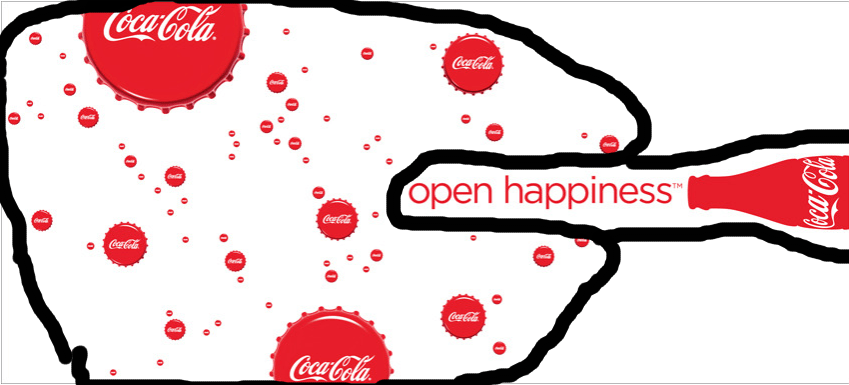
In this ad you can notice how the Coca-cola caps are different sizes to represent different sized bubbles. This helps the illusion of the caps looking like bubbles work better and be easier to recognize. The contrast of the red and white with the caps, the text, and the bottle help the image look stronger.
Repetition:
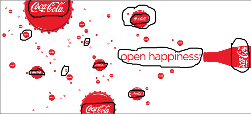
The color red is used throughout the entire piece. This helps the audience represent Coca-Cola because red is frequently used with this brand. The repetition with the brand name “Coca-Cola” is used to make sure you know what the ad is for. Lastly the use of bottle caps is used to look like bubbles which is just a creative way of doing that.
Alignment:

The text on this image is right aligned. This makes the image look more strong then if the text were to just be in the middle of the ad. We can also see that the text and the Coca-cola bottle are aligned together. this can help your eyes go from the slogan straight to the company’s name.
Proximity
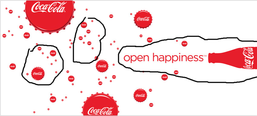
The proximity in the ad is used nicely in this one with the text and the bottle. This shows that they are related because the slogan goes with the bottle of Coca-Cola. All of the bottle caps are near each other because they are showing bubbles coming out of the beverage.
Colors
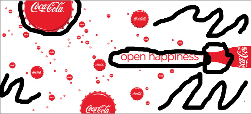
The colors in this ad are very basic, but they are still very effective. With the white background it really helps to bring out the bottle, the text, and the caps. Coca-Cola is very well known with the color red, so this helps with the advertising aspect of it.
Conclusion:
The 5 design principles Contrast, Repetition, Alignment, Proximity, and Colors throughout all of it. Each of them work together to help create the most strong and visually pleasing advertisement. Patty Orlando used familiar colors for the product and great design placement to make the best design.
