About the Author
Ryan LaBar also known as Ryan “Squirrel” LaBar is an interactive designer at Elegant Seagulls (elegantseagulls.com). Along with that he isalso recognized for Illustrator, Yooper, a Mountain Biker, a Fisherman, a Husband, and a Father.
Category Identification Analysis

The header which I analyzed in red is San Serif. I came to this conclusion because of two different reasons. The first is that there are no serifs anywhere which i show with the “T”. The second is that there is no thick/thin transition which I show with the “a”. The Body text which I next analyzed in blue is modern. I discovered this because of three different reasons. The first is the serifs which I showed with the “T”. The second is the fact that there is vertical stress which I showed with the “o”. And the third is that on lowercase letters the serifs are all horizontal.
Typeface Contrast Analysis

The two typefaces San Serif and Modern both contrast each other. The old style header which I circled in red is bold letters making it darker and thicker which is unlike the modern style thin text. This helps you to be able to decipher between what is the header and what is not. It is very commonly known for the header to be bold, so this was a good call on Ryan to do this contrast in the typeface.
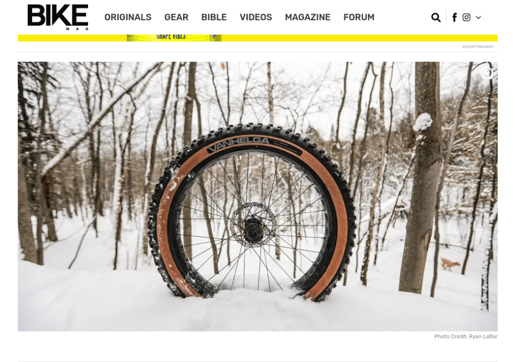
Photography Analysis
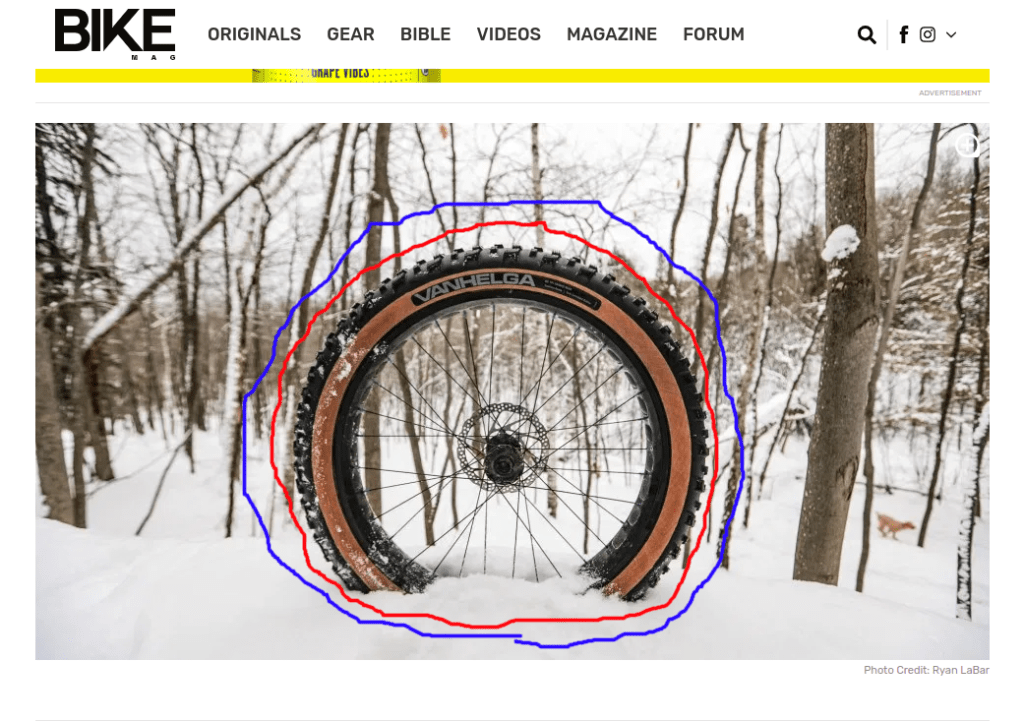
This photograph of a tire is showing us a shallow depth of field. I discovered this because the object of the photo which is on the inside of the red circle is in focus, while the background which is on the outside of the blue circle is out of focus. This technique helps you from getting distracted by anything else in the photo. This is done by blurring what is not important which draws your eye to the subject because it is the only thing not blurred.
Photography Mimics of My Own


I successfully mimicked the original photo by first taking a picture that was exactly like the Ryan’s. With all three of my photos I used the shallow depth of field technique to show what the subject of my photo is. All of these photos could be be placed in the article because they are all the same theme of a bike tire. In a magazine article talking about a bike tire the most important image to have would be a bike tire, so I did just that in three different ways.
Conclusion
Throughout my analysis I have noticed how each thing that I went over actually contributes to the overall layout in a very positive way. Having different type categories helps the reader to know what is what with the different contrasts of text and with the bold and not bold letters. Having a shallow depth of field helps to keep the readers from getting distracted and will keep their minds only on the subject keeping them from thinking about other things. In all, this was a very well put together article because of the smart choices on type and photography.
