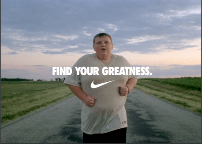

I could not find the name of the person who made this ad, but I was able to get information on it. This picture is from Nike’s “Find Your Greatness” campaign film that cam out on July 27, 2012. Nike news said, “It is a powerful message to inspire anyone who wants to achieve their own moment of greatness in sport.”
Original Ad Design Analysis
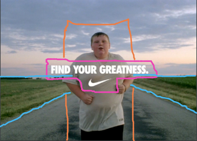
This design has a few different design techniques used. They put the text in center alignment which is the best way to present text in a design. The location of the runner and the road/field caused what looks to be arrows pointing at the runner. With that the runner is in the center of the photo, which looks good because of the other techniques in use.
Original Ad Color Analysis
This design doesn’t have any contrasting text. But that isn’t always needed every time. In this design, and most Nike ads, it is very simple and to the point. The background colors in this photo give off a cool, relaxing feel to them, so just having the white text is perfect for this design.
Original Ad Typography Analysis
Since this is a very simple design there isn’t much with the text. They use the very well known Futura, San serif font that Nike always uses in its designs. This helps for the audience to recognize it right away as Nike. The Nike swish is directly below the text which is nice for seeing the brand right away after reading the slogan.
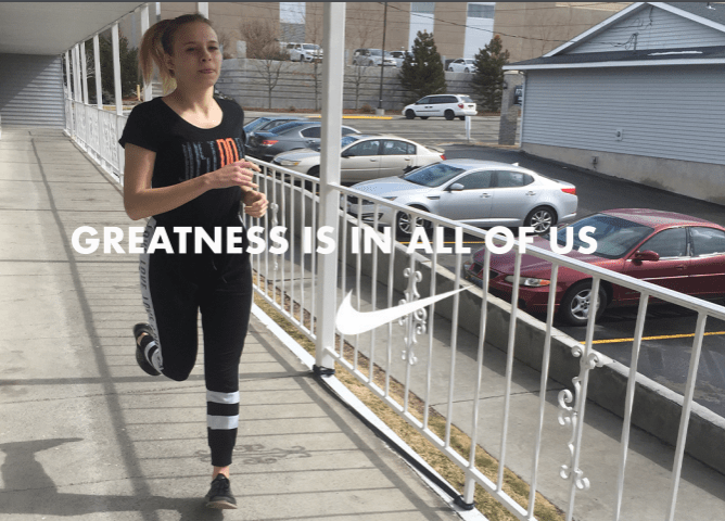
New Ad
New Ad Design Analysis
In my design I tried to make it similar to the original, but also still a little different. I put the text in center alignment just like the original. I made the Nike swish below the text, but I made it a little bigger for contrast and I put it off center to fill up open space. I then got a runner just as the original, but I used the rule of thirds for my design instead of placing her in the center.
New Ad Color Analysis
I tried to do the same exact thing with color in my ad as the original ad. I used only white for the text and the Nike swish. I tried to make the background compliment the text with its light colors and light feel.
New Ad Typography Analysis
Just like the original ad I used the Futura, San serif font that Nike always uses in its designs. I thought it was important to use this font because Nike always uses this, so if I wanted to make it look like they go together I had to to make it look like Nike. The Nike swish is bigger than the text which causes contrast to the two.
Conclusion
The original “Find Your Greatness” Nike ad and my new ad work together very well. I used a different slogan with mine so that it wasn’t the same thing as the original. Mine is similar to the original saying, “Greatness is in All of us.” In all I the two ads have very similar design techniques, so that causes them to look like they go together.
