Be yourself; Everyone else is already taken.
— Oscar Wilde.
This is the first post on my new blog. I’m just getting this new blog going, so stay tuned for more. Subscribe below to get notified when I post new updates.
Be yourself; Everyone else is already taken.
— Oscar Wilde.
This is the first post on my new blog. I’m just getting this new blog going, so stay tuned for more. Subscribe below to get notified when I post new updates.
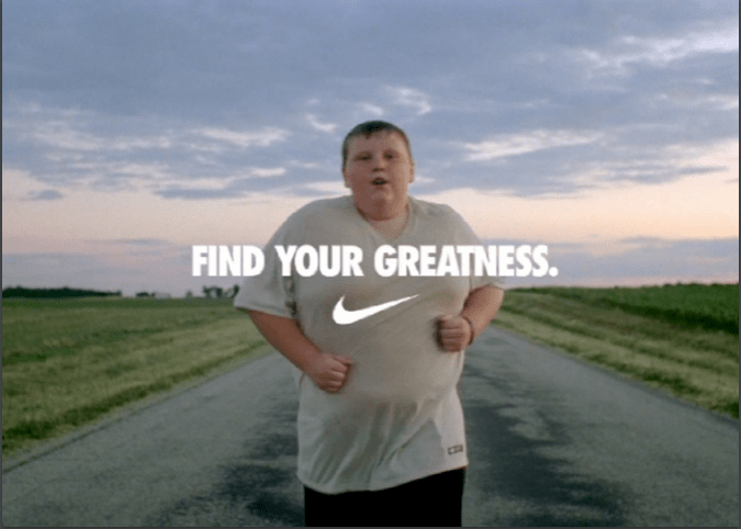

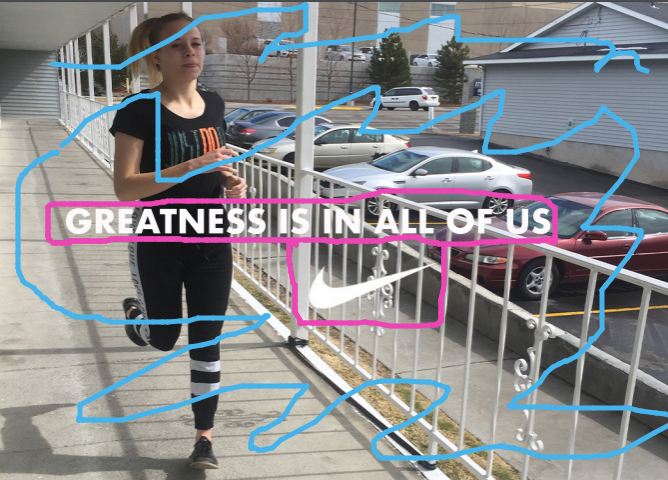
I could not find the name of the person who made this ad, but I was able to get information on it. This picture is from Nike’s “Find Your Greatness” campaign film that cam out on July 27, 2012. Nike news said, “It is a powerful message to inspire anyone who wants to achieve their own moment of greatness in sport.”
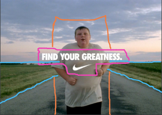
This design has a few different design techniques used. They put the text in center alignment which is the best way to present text in a design. The location of the runner and the road/field caused what looks to be arrows pointing at the runner. With that the runner is in the center of the photo, which looks good because of the other techniques in use.
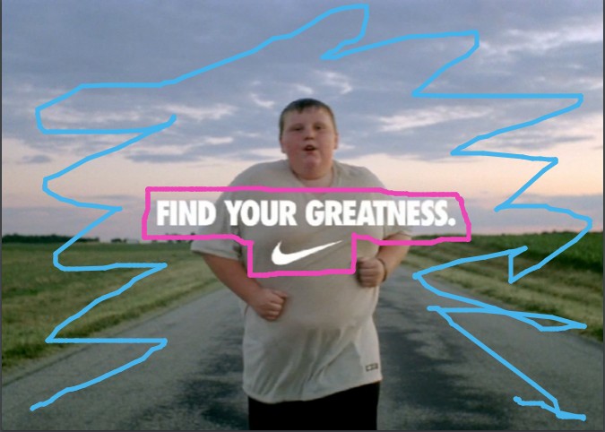
This design doesn’t have any contrasting text. But that isn’t always needed every time. In this design, and most Nike ads, it is very simple and to the point. The background colors in this photo give off a cool, relaxing feel to them, so just having the white text is perfect for this design.
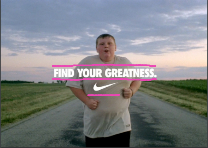
Since this is a very simple design there isn’t much with the text. They use the very well known Futura, San serif font that Nike always uses in its designs. This helps for the audience to recognize it right away as Nike. The Nike swish is directly below the text which is nice for seeing the brand right away after reading the slogan.
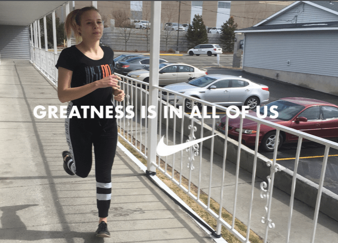
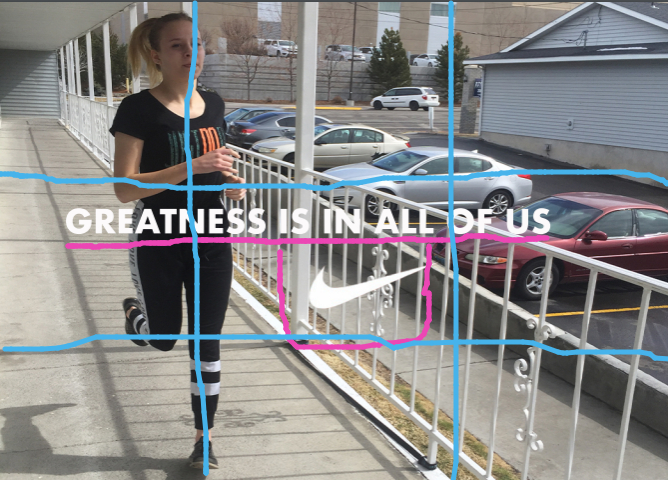
In my design I tried to make it similar to the original, but also still a little different. I put the text in center alignment just like the original. I made the Nike swish below the text, but I made it a little bigger for contrast and I put it off center to fill up open space. I then got a runner just as the original, but I used the rule of thirds for my design instead of placing her in the center.
I tried to do the same exact thing with color in my ad as the original ad. I used only white for the text and the Nike swish. I tried to make the background compliment the text with its light colors and light feel.
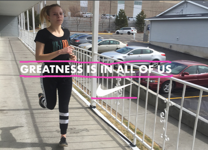
Just like the original ad I used the Futura, San serif font that Nike always uses in its designs. I thought it was important to use this font because Nike always uses this, so if I wanted to make it look like they go together I had to to make it look like Nike. The Nike swish is bigger than the text which causes contrast to the two.
The original “Find Your Greatness” Nike ad and my new ad work together very well. I used a different slogan with mine so that it wasn’t the same thing as the original. Mine is similar to the original saying, “Greatness is in All of us.” In all I the two ads have very similar design techniques, so that causes them to look like they go together.
Ryan LaBar also known as Ryan “Squirrel” LaBar is an interactive designer at Elegant Seagulls (elegantseagulls.com). Along with that he isalso recognized for Illustrator, Yooper, a Mountain Biker, a Fisherman, a Husband, and a Father.

The header which I analyzed in red is San Serif. I came to this conclusion because of two different reasons. The first is that there are no serifs anywhere which i show with the “T”. The second is that there is no thick/thin transition which I show with the “a”. The Body text which I next analyzed in blue is modern. I discovered this because of three different reasons. The first is the serifs which I showed with the “T”. The second is the fact that there is vertical stress which I showed with the “o”. And the third is that on lowercase letters the serifs are all horizontal.

The two typefaces San Serif and Modern both contrast each other. The old style header which I circled in red is bold letters making it darker and thicker which is unlike the modern style thin text. This helps you to be able to decipher between what is the header and what is not. It is very commonly known for the header to be bold, so this was a good call on Ryan to do this contrast in the typeface.
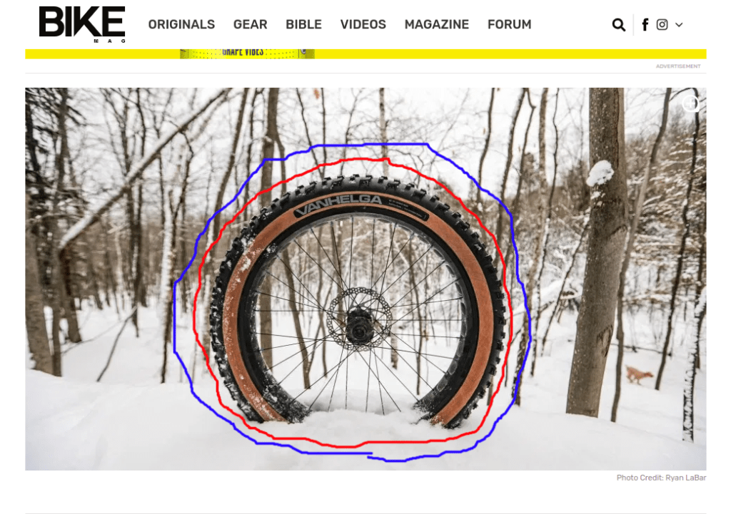
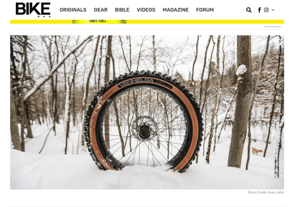
This photograph of a tire is showing us a shallow depth of field. I discovered this because the object of the photo which is on the inside of the red circle is in focus, while the background which is on the outside of the blue circle is out of focus. This technique helps you from getting distracted by anything else in the photo. This is done by blurring what is not important which draws your eye to the subject because it is the only thing not blurred.


I successfully mimicked the original photo by first taking a picture that was exactly like the Ryan’s. With all three of my photos I used the shallow depth of field technique to show what the subject of my photo is. All of these photos could be be placed in the article because they are all the same theme of a bike tire. In a magazine article talking about a bike tire the most important image to have would be a bike tire, so I did just that in three different ways.
Throughout my analysis I have noticed how each thing that I went over actually contributes to the overall layout in a very positive way. Having different type categories helps the reader to know what is what with the different contrasts of text and with the bold and not bold letters. Having a shallow depth of field helps to keep the readers from getting distracted and will keep their minds only on the subject keeping them from thinking about other things. In all, this was a very well put together article because of the smart choices on type and photography.
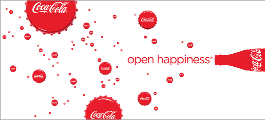

Patty Orlando a Creative/Art Director at Wieden+Kennedy created this Coca-Cola ad to advertise this product on billboards and newspapers in 2009. Coca-Cola has made a big name for itself being one of the most well known beverages in the world since its start in 1886. Coca-Cola is only continuing to grow as the years go on being a global company.
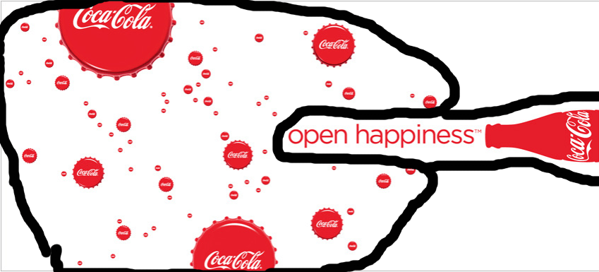
In this ad you can notice how the Coca-cola caps are different sizes to represent different sized bubbles. This helps the illusion of the caps looking like bubbles work better and be easier to recognize. The contrast of the red and white with the caps, the text, and the bottle help the image look stronger.
The color red is used throughout the entire piece. This helps the audience represent Coca-Cola because red is frequently used with this brand. The repetition with the brand name “Coca-Cola” is used to make sure you know what the ad is for. Lastly the use of bottle caps is used to look like bubbles which is just a creative way of doing that.

The text on this image is right aligned. This makes the image look more strong then if the text were to just be in the middle of the ad. We can also see that the text and the Coca-cola bottle are aligned together. this can help your eyes go from the slogan straight to the company’s name.
The proximity in the ad is used nicely in this one with the text and the bottle. This shows that they are related because the slogan goes with the bottle of Coca-Cola. All of the bottle caps are near each other because they are showing bubbles coming out of the beverage.
The colors in this ad are very basic, but they are still very effective. With the white background it really helps to bring out the bottle, the text, and the caps. Coca-Cola is very well known with the color red, so this helps with the advertising aspect of it.
The 5 design principles Contrast, Repetition, Alignment, Proximity, and Colors throughout all of it. Each of them work together to help create the most strong and visually pleasing advertisement. Patty Orlando used familiar colors for the product and great design placement to make the best design.
This is an example post, originally published as part of Blogging University. Enroll in one of our ten programs, and start your blog right.
You’re going to publish a post today. Don’t worry about how your blog looks. Don’t worry if you haven’t given it a name yet, or you’re feeling overwhelmed. Just click the “New Post” button, and tell us why you’re here.
Why do this?
The post can be short or long, a personal intro to your life or a bloggy mission statement, a manifesto for the future or a simple outline of your the types of things you hope to publish.
To help you get started, here are a few questions:
You’re not locked into any of this; one of the wonderful things about blogs is how they constantly evolve as we learn, grow, and interact with one another — but it’s good to know where and why you started, and articulating your goals may just give you a few other post ideas.
Can’t think how to get started? Just write the first thing that pops into your head. Anne Lamott, author of a book on writing we love, says that you need to give yourself permission to write a “crappy first draft”. Anne makes a great point — just start writing, and worry about editing it later.
When you’re ready to publish, give your post three to five tags that describe your blog’s focus — writing, photography, fiction, parenting, food, cars, movies, sports, whatever. These tags will help others who care about your topics find you in the Reader. Make sure one of the tags is “zerotohero,” so other new bloggers can find you, too.